Enterprise Tools: rebuilding B2B subscription management for the Financial Times
The challenge
The FT’s enterprise subscribers (large organisations managing licensed access for hundreds or thousands of employees) were relying on B2B admin tooling that hadn’t kept up with what those customers actually needed day to day: adding and removing users, understanding usage, and managing topic and newsletter follows at scale. For the FT’s largest licence holders, that friction showed up directly in satisfaction scores. Data analysis, NPS surveys and feedback from both customers and FT sales staff made it clear the system had useless, confusing features that were putting people off the wider suite of tools, while providing poor value for money on what’s a premium part of the FT’s B2B package.
What we did
We were brought in as the UX & Product Design team to turn that feedback into an evidence-based case for what to fix. That started with the unglamorous part: requesting and analysing usage data to build an honest picture of how the system was actually being used, not how it was assumed to be used.
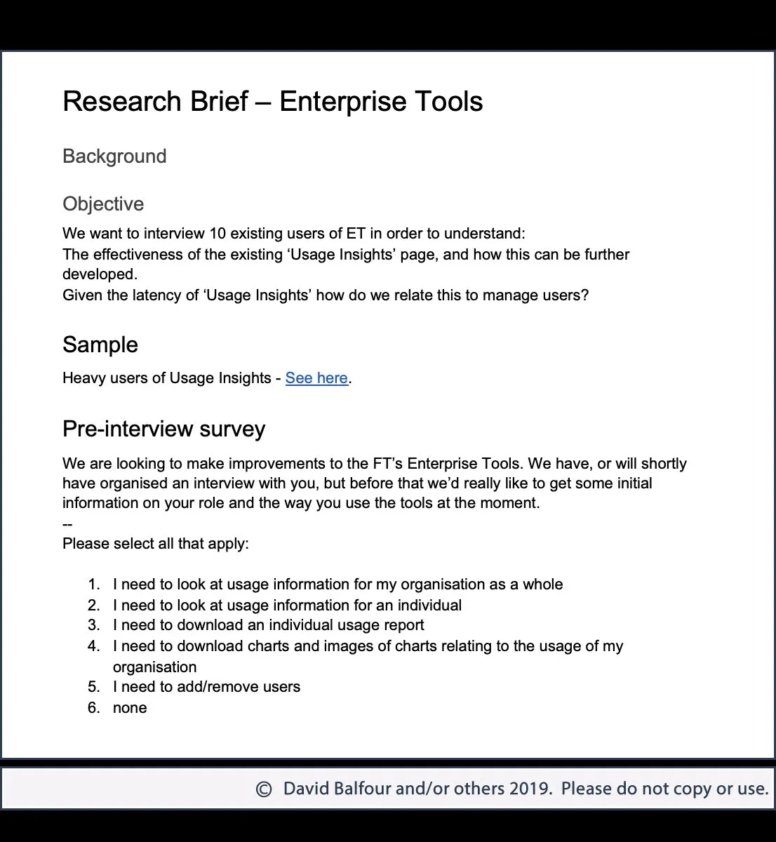
From there we ran workshops to define the different people actually using the tools: content distributors, seat managers, technical admins handling things like SSO, and budget holders, since “enterprise admin” was never really one user with one set of needs. That let us identify which existing features looked safe to remove, which needed improving, and which needed replacing outright.
We worked with the FT’s customer research and data science teams to recruit a set of users for an initial Qualtrics survey, then follow-up interviews to validate what we thought the data was telling us. From there it was user journey maps, flows, wireframes and working prototypes, built directly in HTML, JS and CSS on the FT’s own Origami design system rather than in Sketch or Axure, which turned out to be faster to iterate in and meant developers could take the prototype code and ship it as final markup rather than rebuilding it from a picture. We ran the whole project Lean UX-style (design, build, test, iterate), which worked well because we had a standing bank of customers and FT sales staff we could keep coming back to for feedback on the latest round of designs.
Some of the new screens
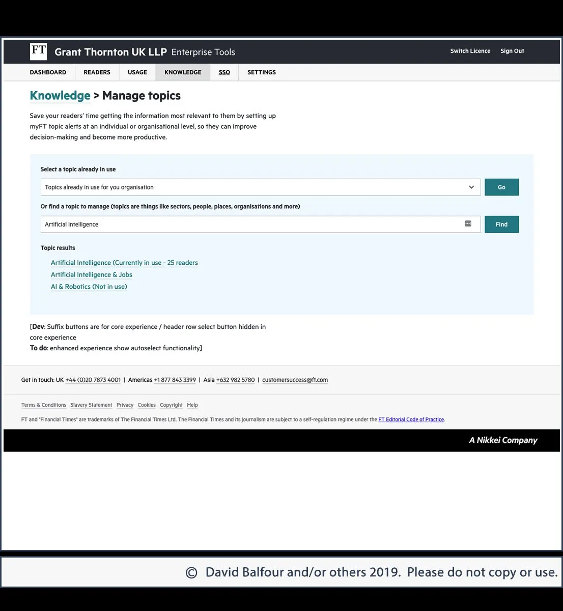
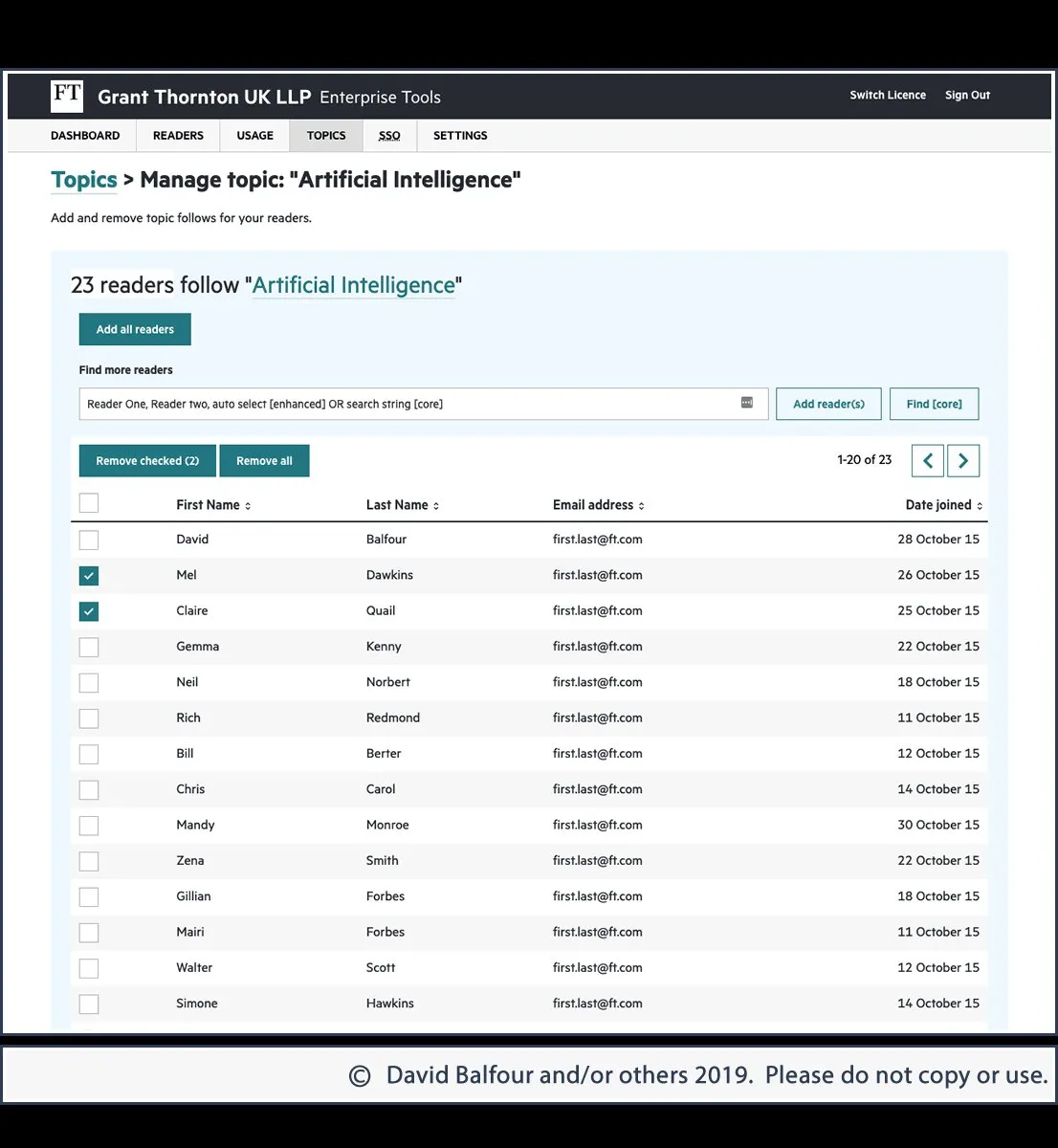
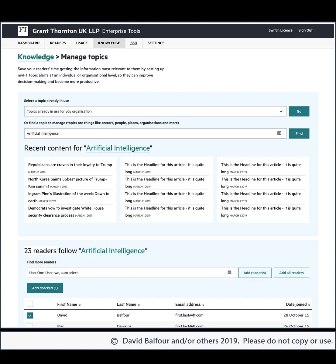
The redesign reorganised enterprise admin around a handful of clear jobs: managing which topics and newsletters an organisation’s readers follow, understanding usage, and running everything through a consistent Knowledge hub rather than scattered settings pages.
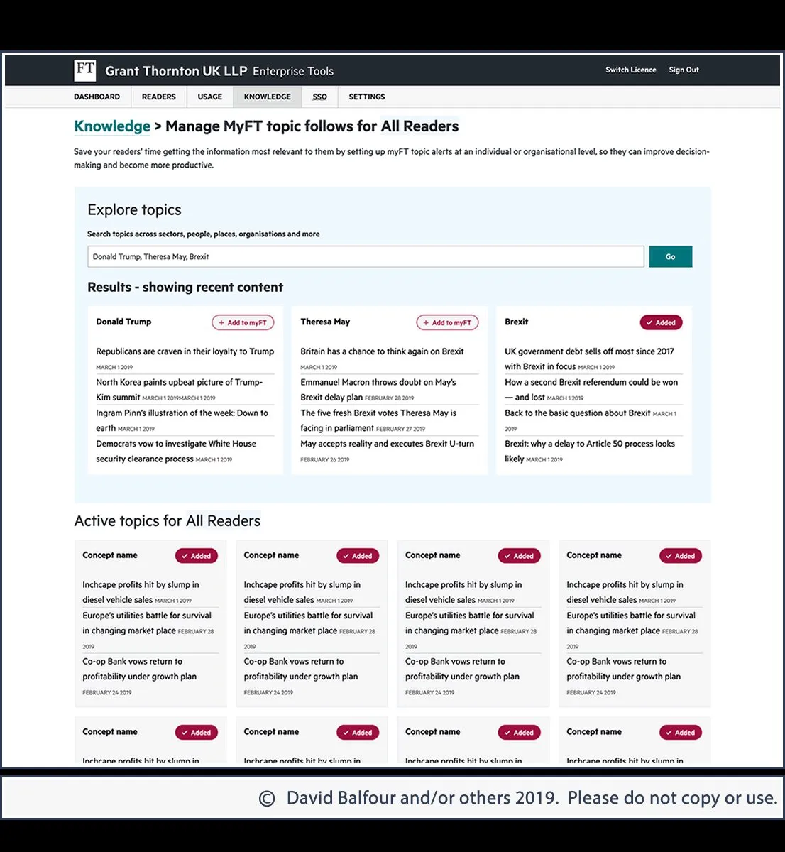
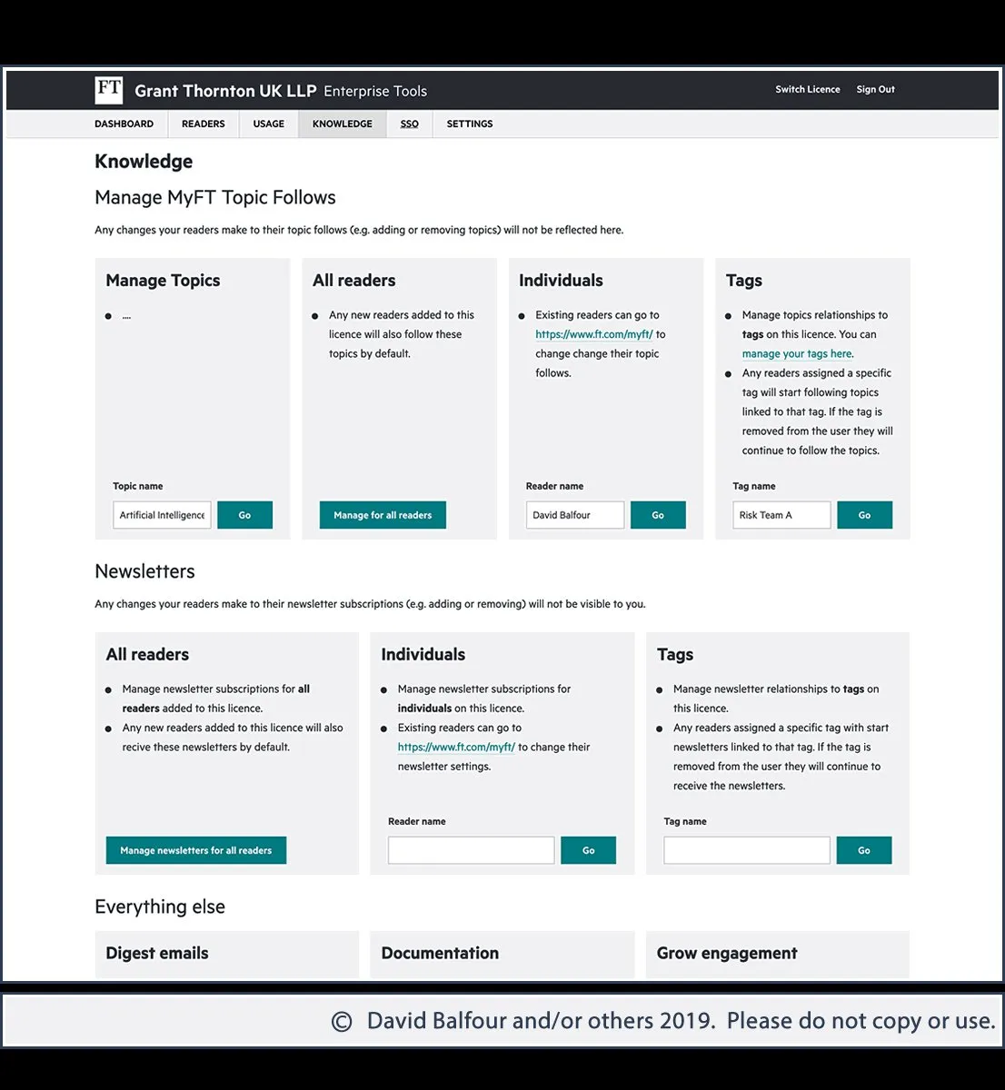
Challenges
Enterprise tooling carries a specific kind of pressure that consumer products don’t: the people using it aren’t the FT’s end readers, they’re IT and procurement administrators inside large organisations, often managing access for people who never interact with the FT brand directly. Getting the workflows right meant designing for administrators’ mental models (licence pools, seats, approvals) rather than editorial or consumer patterns.
Gathering good enough evidence to justify removing or replacing existing features meant presenting findings to the head of B2B directly, and arranging workshops with FT sales teams across every region was genuinely hard: both the time-zone logistics of including everyone, and convincing senior managers that the time away from selling was worth it. On top of that, keeping a team of four developers consistently supplied with well-scoped work across a two-year build was its own ongoing balancing act.
Success
The project met its objective of a 10 point increase in end-user NPS, alongside a notable rise in engaged users across the organisations using the tool. The redesigned system rolled out to over 2,000 organisations in early 2018, after roughly two years of evidence-led design and development.
← Back to all case studies