Spotlight.me: designing a link-in-bio app that helps people find each other
Spotlight.me is a product of our own. We took it from strategy through brand, UX, a working prototype and a technical plan, the same way we work with clients, to prove that process end to end.
The gap
Link-in-bio tools like Linktree send traffic outward and stop there: users aren’t connected to each other, and there’s no discovery or community built in. Separately, social discovery apps are app-only, with no public identity or shareable link. A review of fifteen competitors (ten link-in-bio tools, five discovery apps) found that none did both.
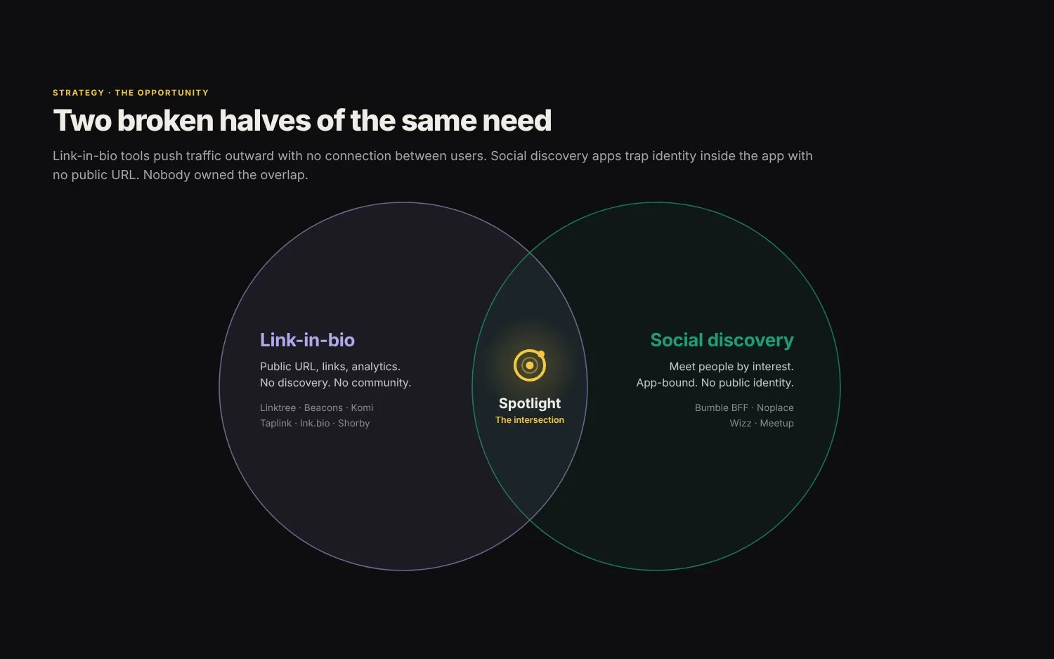
Spotlight.me is built to close that gap: a link-in-bio identity and an interest-based discovery profile in one, at a single shareable spotlight.me/username link.
What we did
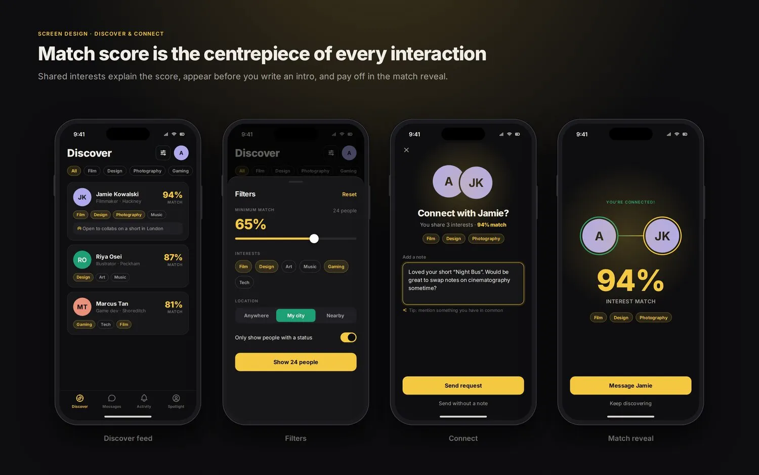
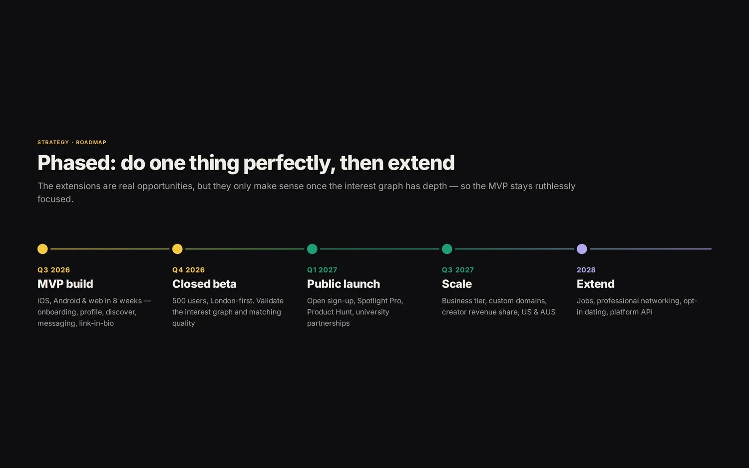
This was end-to-end product work, well beyond a design pass: positioning and a competitor review, market sizing and a phased roadmap, then straight into UX for the full journey: a five-step onboarding flow, a Discover feed with match scores and filters, the connect flow, messaging, settings and analytics for paid users.
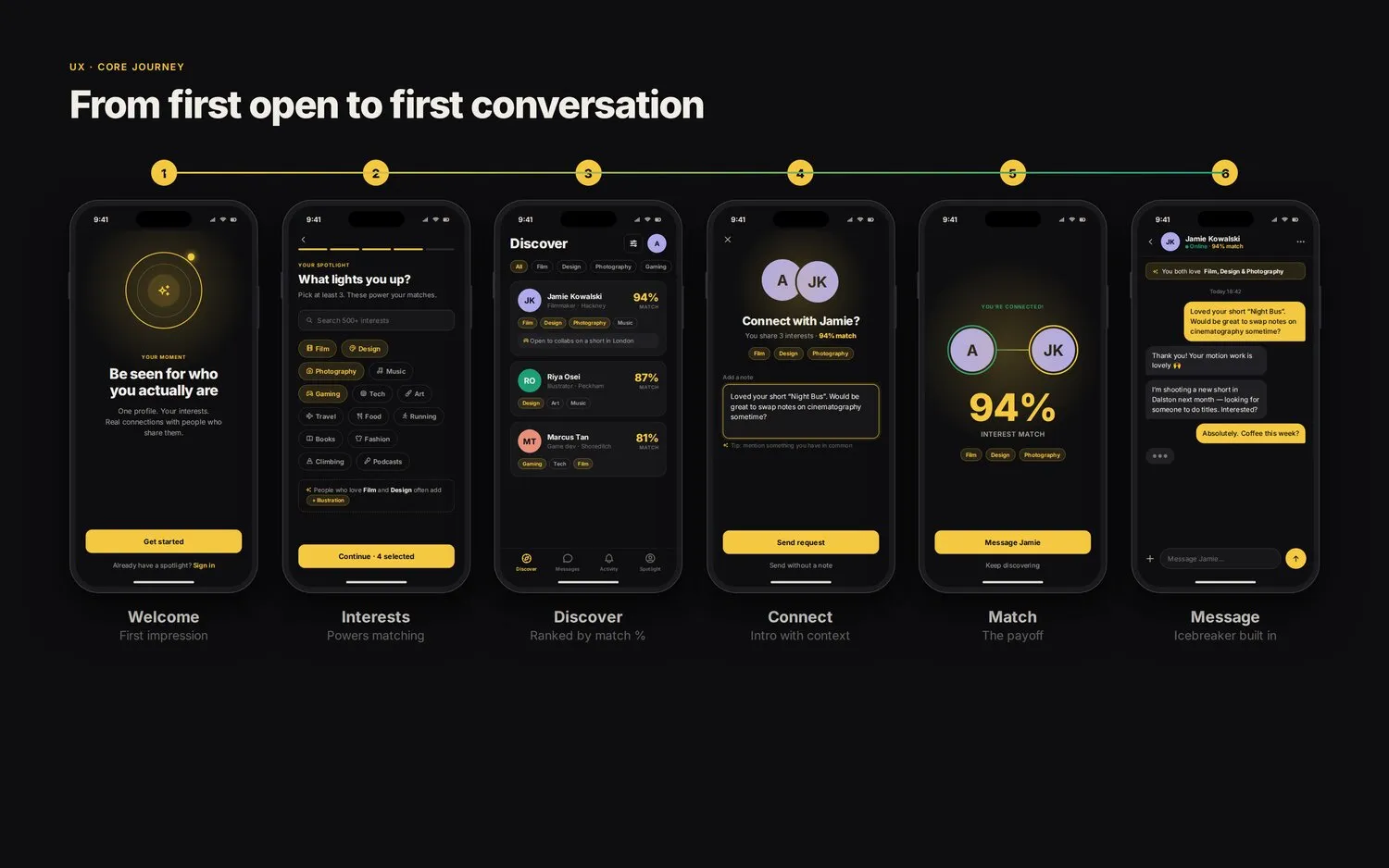
A few of the decisions worth calling out:
- The match score is the headline on every card, with shared interests highlighted so the number explains itself rather than needing a legend.
- Username availability is shown during sign-up, so someone sees the link-in-bio value before they’ve finished onboarding.
- One public profile screen serves two audiences: a logged-out visitor sees a link-in-bio page, a logged-in user sees a discovery profile (the same URL, no separate product to maintain).
- No swiping. Connections are context-first and intentional, a deliberate departure from the mechanic most discovery apps default to.
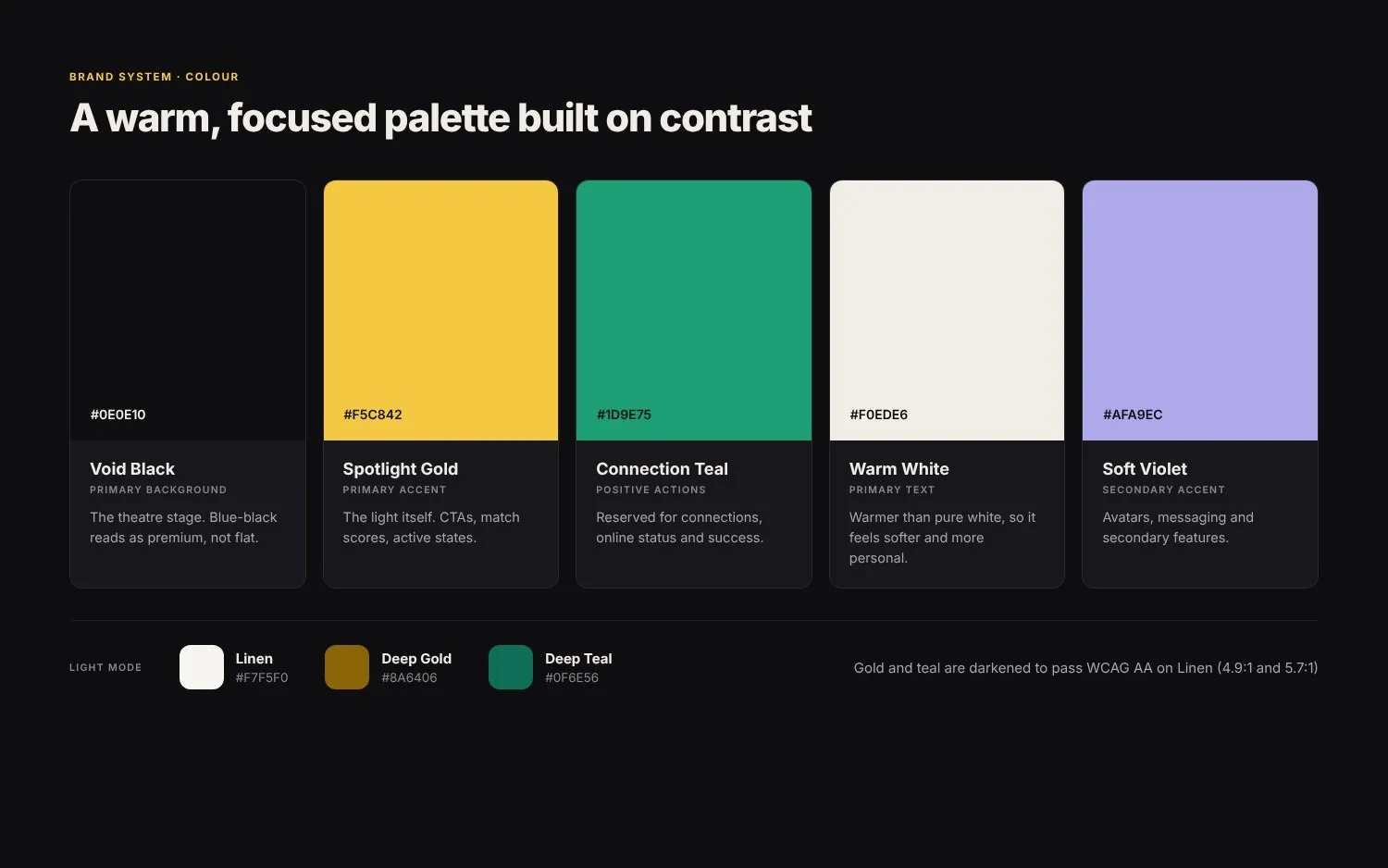
Alongside the UX, we built a full brand system, a “theatre spotlight” concept: void black, spotlight gold, connection teal and soft violet, with a WCAG AA-adjusted palette for light mode.
The result is a real, responsive public website as well as the app itself. Every spotlight.me/username link is a shareable, logged-out-visible page in its own right as well as an in-app profile.
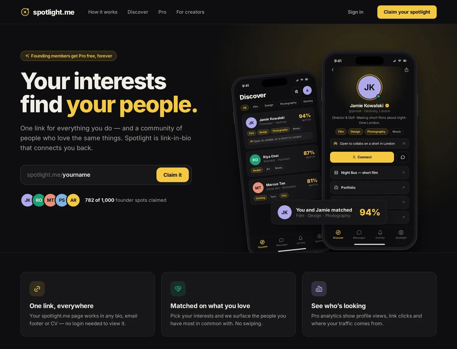
An interactive prototype lets you tap through every one of these flows, from first open to a matched conversation. A technical architecture was scoped alongside the design: Expo/React Native, Supabase, Next.js on Vercel, specifically so the design wouldn’t outrun what could actually be built.
Where it stands
Spotlight.me is pre-launch: there are no usage or retention figures yet, so this is presented as a product strategy, brand and design case study, not a results one.
Why it’s worth including
It’s the clearest example of Media Dreams doing complete product work on its own account: strategy through to brand, UX, a working prototype and a technical plan capable of being built quickly, the same Prototype Sprint thinking offered to clients, applied to our own product.
← Back to all case studies