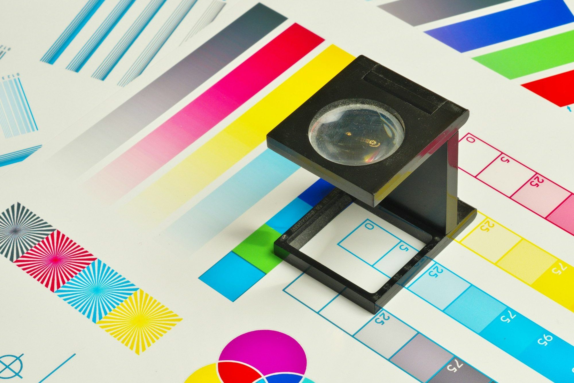
Press Print on most modern websites and you get a screenshot with the lights off: a navigation bar floating across the first page, cards sliced in half at the page break, a heading stranded alone at the bottom of a sheet, and no clue where the page came from. Nobody designed that. It’s simply what happens when nobody checked.
We checked. This article is a reference for how we make our own site print well, with the actual techniques, and it doubles as the example: you can print this page right now and see every detail described below.
Why print is worth the effort
It’s easy to assume nobody prints any more. In practice the web is still how a lot of documents get created: a case study that goes into a board pack, a proposal that gets annotated in pen, a terms page that has to be signed off, a long article someone would rather read on the train without a screen. “Save as PDF” is also print. It is how a web page becomes an attachment, an archive copy or a procurement document.
The people who print or save a page are often the most important readers you have. They are forwarding you to someone who will make a decision, and the paper or PDF is what that person sees. For some readers, including people who find screens tiring, paper is also the accessible format.
Why it gets overlooked
Print falls between disciplines. Designers work in screen frames and rarely mock up paper. Developers test in a browser window and never press Print. Analytics can’t see it, so it never shows up as a problem. And because the failure is quiet (no error, no broken layout on screen), it survives for years.
The fix is mostly attention, not budget. A print stylesheet is usually a few hundred lines, and you can write the first useful version in an afternoon.
Attention to detail: dotting the i’s
The difference between “it prints” and “it’s designed for print” is a pile of small things.

- The brand dot prints. Browsers strip backgrounds when printing by default, which turns a coloured dot into nothing. One declaration,
print-color-adjust: exact(with the-webkit-prefix for Safari), tells the browser that this particular colour matters. - Every page says where it came from. A “Printed from” line carries the address and the date, so a sheet found in a folder next year can be traced back and judged for age.
- Links keep their destination. On paper a link is just underlined text, so external links print their address after them. If the visible text already is the address, we skip the duplicate.
- Page numbers as “Page 2 of 4”. Small, set in the same mono as the rest of the site, and always present.
- Nothing is cut in half. Cards, quotes, figures and table rows stay in one piece.
- Headings never sit alone at the foot of a page.
- Colour is safe. Paper is always white, text is always dark, accent colours are darkened a notch so they hold up on a cheap office printer.

The techniques
None of this needs a framework. It’s CSS, plus a little JavaScript for the two places where browsers disagree.
1. A print stylesheet that owns the page
Start with the page itself. @page sets the paper size and margins, and the margin boxes let you print running footers with real page counters.
@page {
  size: A4;
  margin: 16mm 15mm 18mm;
  @bottom-left  { content: "Media Dreams · mediadreams.co.uk"; font: 8pt 'IBM Plex Mono', monospace; }
  @bottom-right { content: "Page " counter(page) " of " counter(pages); font: 8pt 'IBM Plex Mono', monospace; }
}
Set the size to the paper you actually print on. Defaulting to US Letter on a UK site is exactly the sort of detail that gives the game away.
2. Remove the interface, keep the content
Navigation, search, forms, carousels, cookie controls and buttons do nothing on paper. Hide them in one place, and show anything that only makes sense in print, such as the “Printed from” line.
@media print {
  nav.site .links, .settings-menu, .nav-toggle, form, video, dialog,
  .btn-primary, .btn-secondary, .cs-cta { display: none !important; }

  .print-only { display: block; }   /* hidden on screen, shown on paper */
}
3. Tell the browser where it may break
Page breaks are where print goes wrong. The two properties to know are break-inside: avoid for things that should stay whole and break-after: avoid for headings that should stay with what follows.
@media print {
  figure, img, table, blockquote, .card, .stat, .faq-item { break-inside: avoid; }
  h1, h2, h3, h4, .eyebrow                               { break-after: avoid-page; }
  p, li { orphans: 3; widows: 3; }   /* no single stranded lines */
}
4. Where Safari and Chrome disagree
This is the part you only find by testing in both. Chrome honours break-after: avoid. Safari has historically ignored it, so a heading can still be left alone at the bottom of a page, while break-inside: avoid on a wrapper is the rule it follows more reliably. So for the print only we wrap each heading with the block that follows it and apply that rule to the wrapper, then unwrap afterwards.
// Safari ignores break-after: avoid. Keep a heading and its next block together instead.
window.addEventListener('beforeprint', () => {
  document.querySelectorAll('main h2, main h3, main .eyebrow').forEach((h) => {
    const next = h.nextElementSibling;
    if (!next || next.offsetHeight > 70 * 96 / 25.4) return;   // don't glue a heading to a huge block
    const wrap = document.createElement('div');
    wrap.className = 'print-kwn';                             // break-inside: avoid
    h.before(wrap);
    wrap.append(h, next);
  });
});
window.addEventListener('afterprint', () => { /* put everything back */ });
The same event hook is useful for the other two things CSS can’t do: opening collapsed <details> elements (a closed one prints nothing) and loading lazy images and embeds that were never scrolled into view.
5. Rows of cards that can’t split
A grid of cards is the classic print casualty, because a row can break across two pages even when each card is protected. We regroup cards into rows on print, and draw each row as a table row, which browsers refuse to split.
.print-row { display: table; table-layout: fixed; border-spacing: 4mm 0; width: 100%; break-inside: avoid; }
.print-row > * { display: table-cell; vertical-align: top; }
6. Links, and scaling type for paper
Screen sizes read large on A4. Rather than redefine every size, we scale the whole page once and keep every relationship between headings, captions and cards exactly as designed. For links, the address is printed after the text, but only when it adds something.
@media print {
  html { zoom: .88; }                      /* 15px body text becomes roughly 10pt */

  main a[href^="http"]:not([data-print-self])::after {
    content: " (" attr(href) ")";
    font: 8.5pt 'IBM Plex Mono', monospace;
    word-break: break-all;
  }
}
7. Embeds, mockups and colour
Interactive mockups and videos are the hardest case. A video prints as a blank box, so hide it. A designed HTML slide can print as a picture, but it needs to be drawn at its native size and scaled to the frame, or it prints with odd padding and a different background. Container query units make that scale automatic.
.embed-frame { position: relative; container-type: inline-size; overflow: hidden; }
.embed-frame iframe {
  position: absolute; left: 0; top: 0; width: 1280px; height: 720px;
  transform-origin: 0 0;
  transform: scale(tan(atan2(100cqw, 1280px)));   /* frame width ÷ 1280 */
}

.brand-dot { -webkit-print-color-adjust: exact; print-color-adjust: exact; }
8. Make the layout rules structural
The most useful lesson was not a property at all. When each page type gets its own print tweaks, pages drift apart: a gap that’s right on one page is wrong on the next. We now key the print spacing to the shape of the markup (an eyebrow directly followed by a heading looks the same on every page) rather than to page classes, and a build step warns if a page breaks that shape.
.eyebrow:has(+ h1) { margin-block: 0 var(--print-eyebrow-gap) !important; line-height: 1.2; }Testing it properly
Browsers differ, and DevTools’ “Emulate CSS media type: print” only gets you part of the way. What works:
- Print to PDF in both Chrome and Safari, and compare the two. Most print bugs only appear in one of them.
- Check at the real paper size, with the browser’s own scale at 100%.
- Automate the boring part. A small script can print each key page to PDF at several page heights, read the text of each page, and flag any page whose last line is a heading. The core of it is only a few lines.
- Look at the output as a reader would. Dark mode off, backgrounds off, and a real printer at least once.
// Flag pages that end on a heading (run against a local build)
const lastLine = pdfPageText.trim().split('\n').filter(Boolean).at(-1).toLowerCase();
if (headings.includes(lastLine)) console.warn(`Stranded heading on page ${n}: "${lastLine}"`);
A quick checklist
- A print stylesheet exists and is loaded on every page.
- Paper size, margins and page numbers are set deliberately.
- Interface chrome is gone; the content has room to breathe.
- Cards, figures, quotes and table rows don’t split; headings never sit alone.
- Links show their destination; the page shows its source and date.
- Brand colours that matter are forced to print; everything else is safe on a mono printer.
- Embeds either print as a picture or are hidden.
- You’ve tested in more than one browser.
Try it on this page
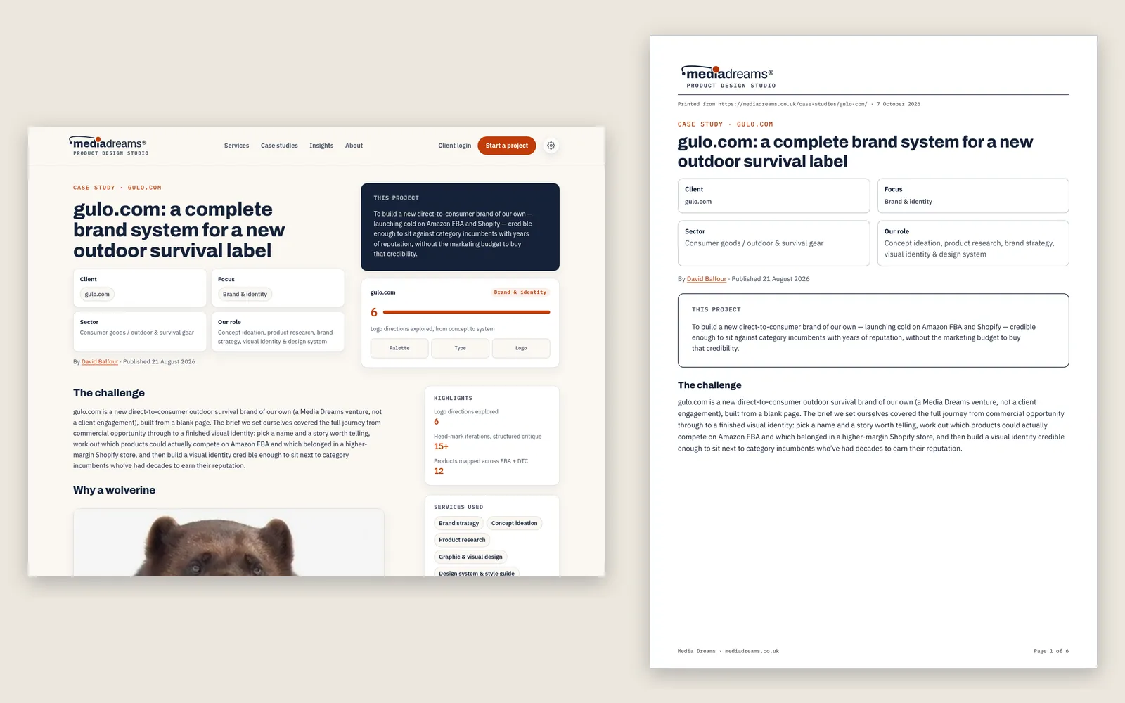
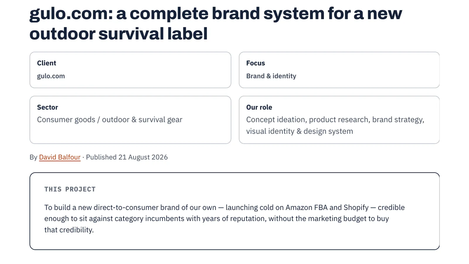
Everything above is live on this site. Print this page, or save it as a PDF, and look at the details: the logo and its dot, the “Printed from” line, the page numbers, the code blocks reflowed for paper, the figures kept whole and the headings kept with their text.
If your own site prints like a screenshot with the lights off and you’d like it to print like it was designed, get in touch and we’ll take a look. Print is also one of the surfaces we cover when we build a design system, so the rules stay consistent as the site grows.
← Back to all insights